|
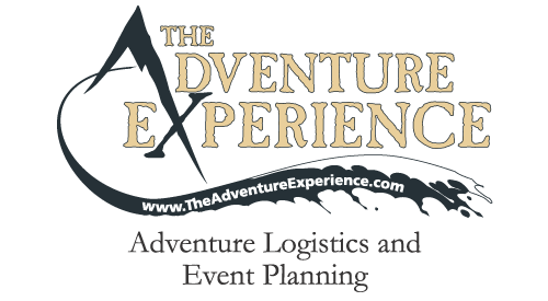
The owners of The Adventure Experience knew what they wanted in a logo - something very interesting, unique, professional, yet fun.
No problem.
I combined some outdoor imagery - the mountain "A" and flowing river underneath - along with a distinct, appropriate font. The layout, font selection and mountain came relatively easily, but I struggled for quite a while ensuring the river looked just right. This is their logo - it has to be perfect for them.
And, it is.
The stylized "A X" was used as an icon for their promotional material - clothing and the like.
<-- Back to my logo portfolio.
|
|
|
|
|
|